API Connector Documentation
Construct a CRM Dashboard in Google Sheets
There are lots of great tools available for Customer Relationship Management (CRM) to help you not only win new customers from leads, but also maintain customer relationships by keeping them within your pipeline (better thought of as a cycle). While pipedrive offers an all-in-one service to keep track of customer leads, you may at some point want the to export the raw data to Google Sheets and make your own visualization tools. In this tutorial, I will show you exactly how to accomplish that!
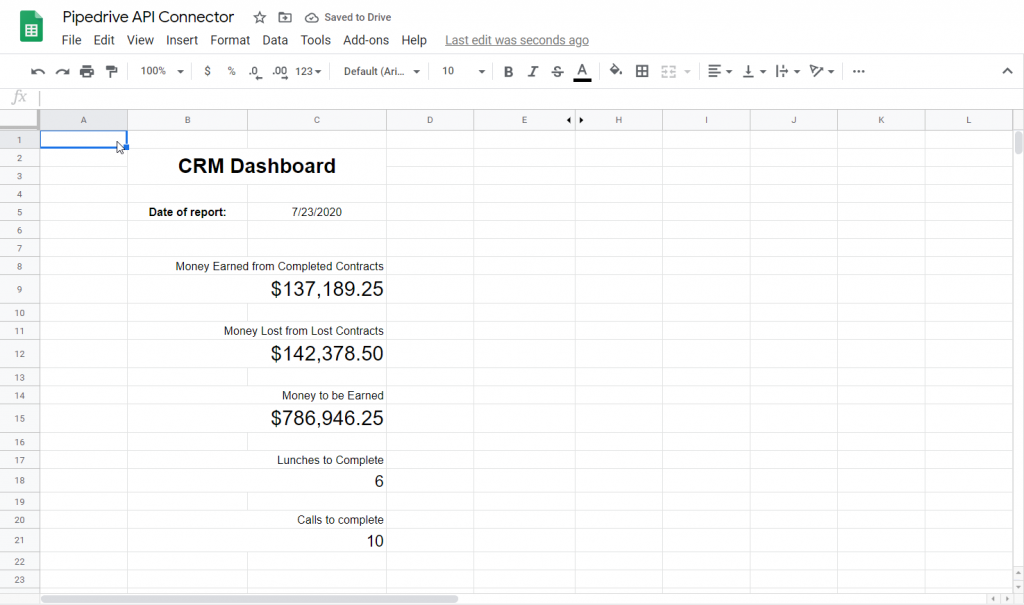
If you want to skip ahead to the finished product, just jump to this link. Make sure you make a copy if you want to tinker with the underlying formulas! The end result looks like this:
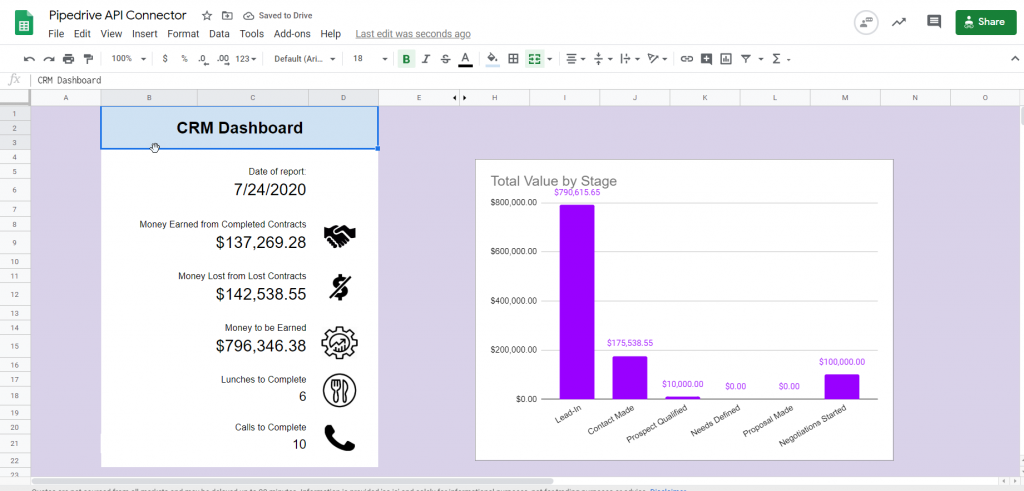
Note: This tutorial requires the pro version of API Connector, as the data from pipedrive needs to be wrangled into Google Sheets via the JMES path.
CRM Dashboard Design
When creating a dashboard for CRM, lets brainstorm some of the things we might be interested in displaying. Things that come to mind include:
- Total sales to-date
- Potential sales
- Volume of opportunities in each stage
- Volume of open opportunities
- How many upcoming activities you need to accomplish (calls, lunches, etc)
So let's get right to it! Here's an overview of all the steps we will take to get our Dashboard up and running.
CONTENTS
- Part 1: Preliminary Setup and Raw Data
- Part 2: Getting Specific Columns
- Part 3: Convert Currencies
- Part 4: Aggregate Data
- Part 5: Map Stage Names to New Column
- Part 6: Let's Make Some Graphs!
PART 1: PRELIMINARY SETUP AND RAW DATA
Let's start by setting up three new sheets. Let's label them "Deals_Raw_Data", "Dashboard", and "Extra_Data".

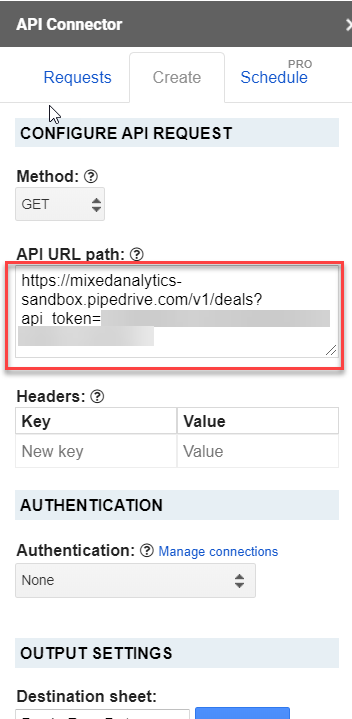
Now we want to pull in our raw data from pipedrive. Heading over to the documentation, we can find the URL to grab all deals looks something like this:
https://YOUR_URL.pipedrive.com/v1/deals?api_token=YOUR_API_TOKEN
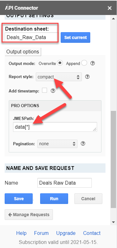
That's it for the URL! Just add that to API URL path. The only thing we need to do now is head down to the Output Options in API Connector and change Report style to "compact", and set JMESPath to "data[*]". Lastly, make sure you set Destination Sheet to "Deals_Raw_Data". You should end up with something that looks like this:
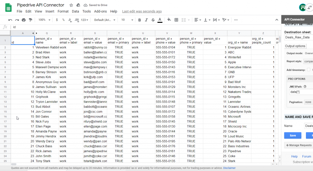
Go ahead and run your request to get something like this:
PART 2: GETTING SPECIFIC COLUMNS
We have a ton of columns in this sheet, but we don't need all of them! For this dashboard, we are mainly interested in getting quantitative data on our customers, not so much their contact information. Go ahead and hold Ctrl and click on the column names that look interesting to you. I ended up getting these:
| person_id » name | org_id » name | org_id » address | status | value | currency | stage_id | next_activity_type |
Once you've selected all of the columns that look interesting, let's paste them over in our "Dashboard" sheet. Above the pasted raw column names, you can go ahead and rename them some more pleasing to the human eye.
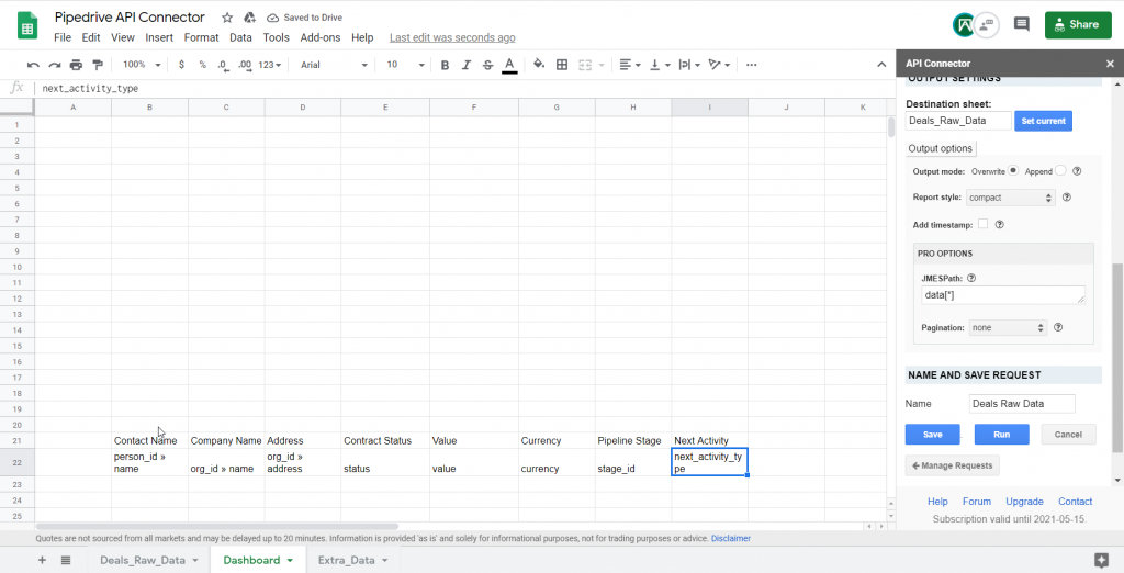
I put a lot of extra space above our column names so we can make room for our fancy dashboard later.
Now we need to copy over the data from the raw data sheet. The easiest way to do this is by inserting the below formula into the cell directly below our first column over in the Dashboard sheet:
=QUERY(Deals_Raw_Data!$1:$10000,"SELECT "&SUBSTITUTE(ADDRESS(1,MATCH(B22,Deals_Raw_Data!$1:$1,0),4),1,""),1)
Make sure you change the value B22 right after the MATCH function to the corresponding cell that contains the raw data's column name! You should end up looking like this:

And after hitting enter:
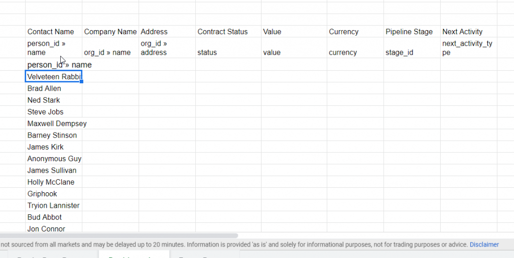
Now go ahead and drag the cell with the small blue square to copy this formula to the other remaining columns:
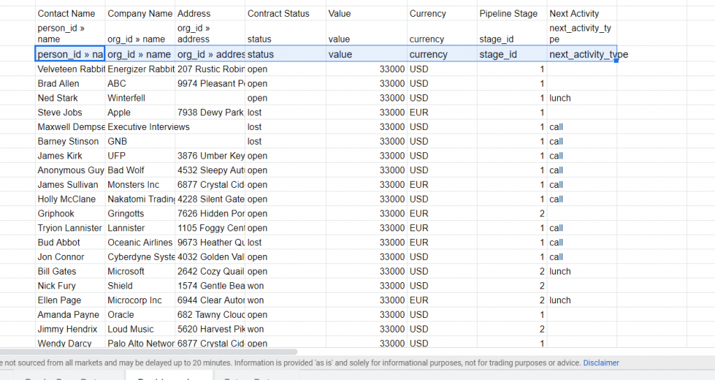
Phew! Okay, let's go ahead and do a little housekeeping and clean up some of the columns to be a bit more useful and standardized.
PART 3: CONVERT CURRENCIES
You may have noticed that the currency column has two different currencies: USD and EUR. Let's standardize our column to one currency using a formula trick. Head over to the Extra Data sheet and setup a small table like this:
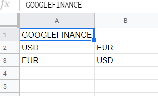
Now we are going to use the function GOOGLEFINANCE() (I typed that at the top of my table to remind me which one to use). This function is a little different than the standard format you may be used to, but nonetheless set it up like this:
=GOOGLEFINANCE("Currency:"&A2&B2)
The cell value will be the exchange rate between the two currencies. Your little conversion table should look like this now:
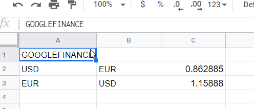
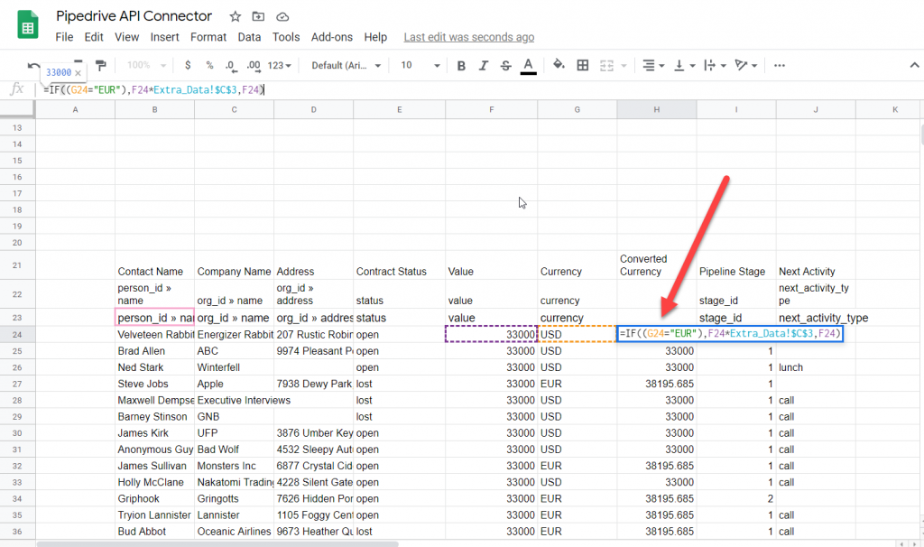
Now, by going back over to the Dashboard sheet, let's setup an IF function to deal with our Euros and convert them to good ol' fashioned US bucks. First we need to insert a new column somewhere and call it "Converted Currency" or something like that. Then we can use the conditional IF formula below to convert EUR to USD:
=IF((G24="EUR"),F24*Extra_Data!$C$2,F24)
After dragging the formula down the column, any values that are listed in EUR should be converted to USD now.
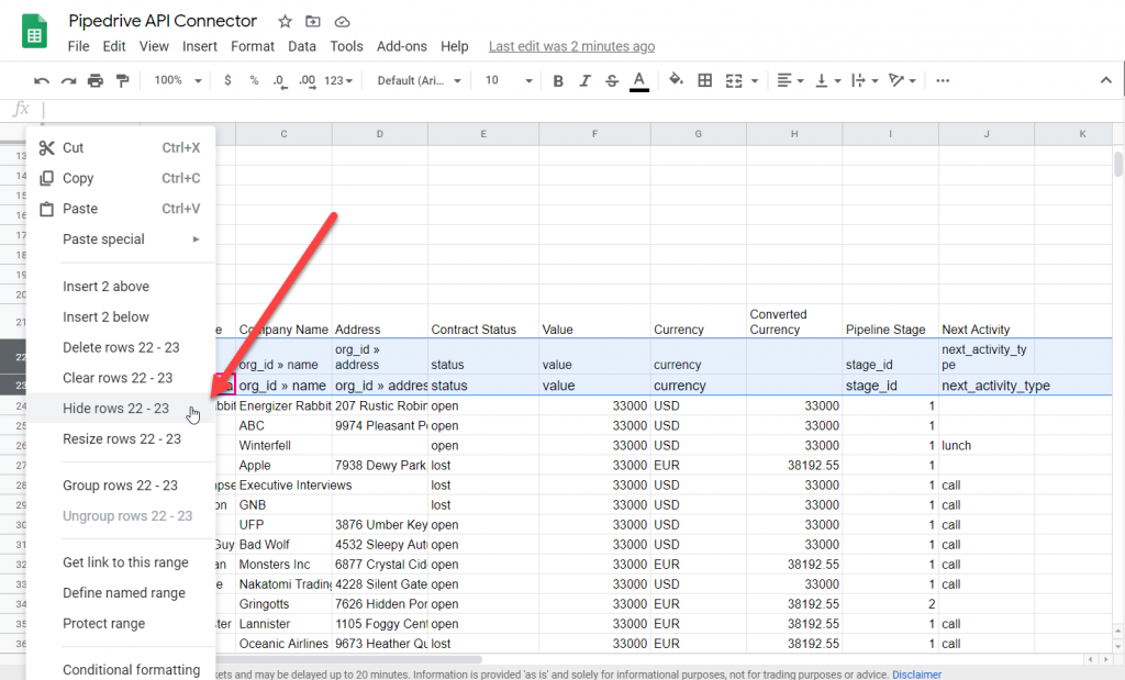
For aesthetic purposes let's go ahead and hide the hideous raw data column names to clean up our Dashboard environment a bit.
PART 4: AGGREGATE DATA
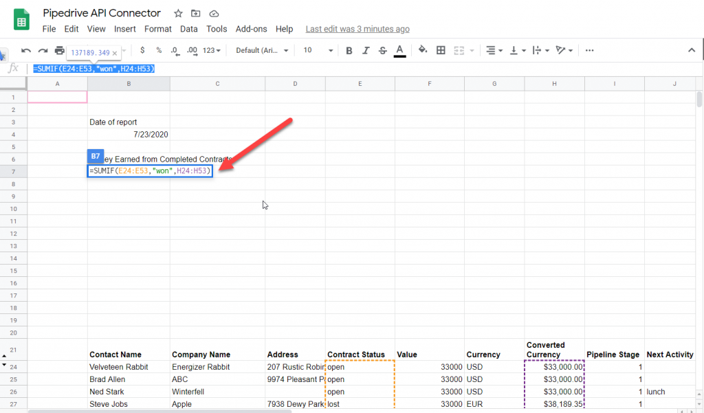
From our little brainstorm at the beginning of this tutorial, we can start manipulating our data to make clean insights. Let's start by finding out how much money we've made so far on completed contracts.
For this, we will use the SUMIF() function. We start by defining the range we want to check our conditional with, followed by the conditional, followed by the range of data to sum. In our case, it should look something like this:
=SUMIF(E24:E53,"won",H24:H53)
Now, let's see how much money we've LOST in contracts. We can use a similar formula as above, but change the second argument to "lost".
=SUMIF(E24:E53,"lost",H24:H53)
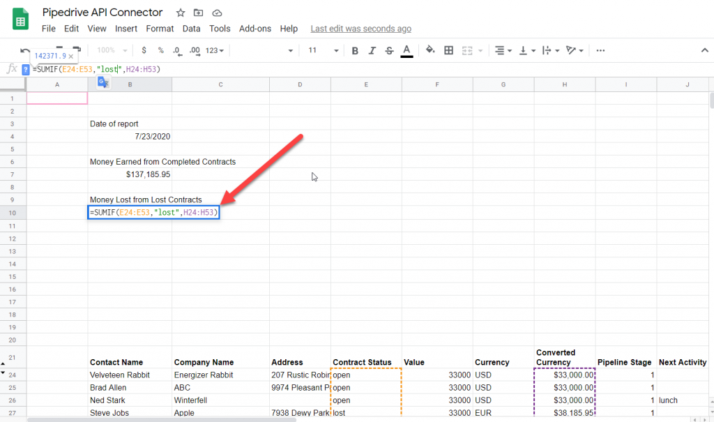
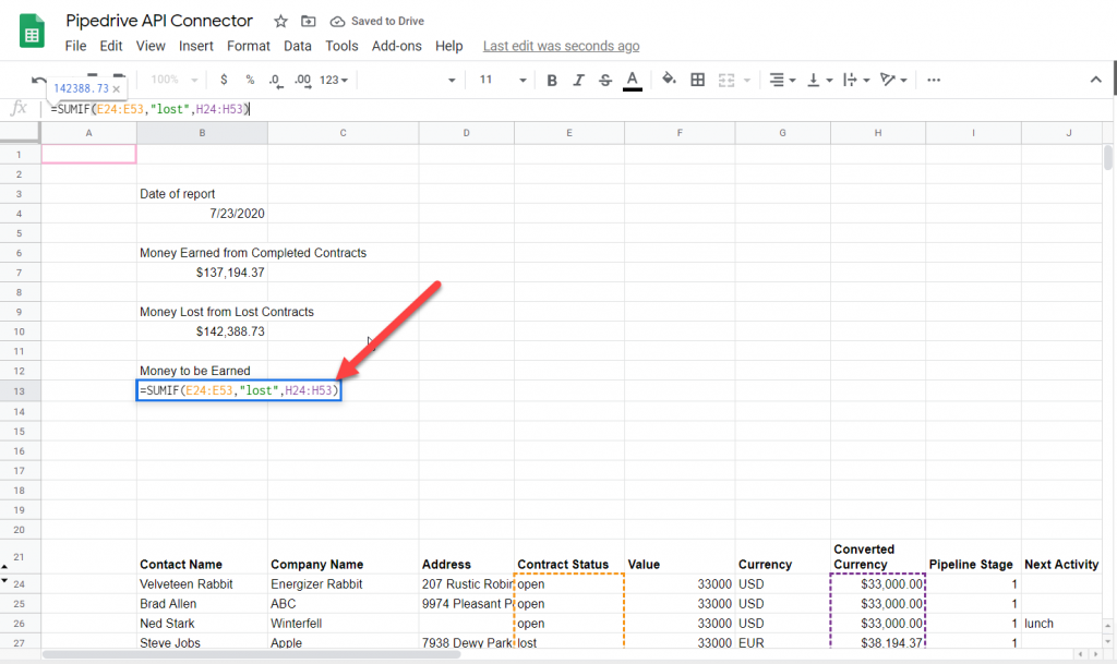
Lastly, and probably most importantly, we want to see how much money is on the line currently. Following the same flow as the last two functions, we will set the 2nd argument to "open" this time.
=SUMIF(E24:E53,"open",H24:H53)
Now, let's see how many lunches and phone calls we have remaining to do with potential customers. We can use the COUNTIF() function to conditionally count values in a column. Let's count how many lunches and calls we have left to accomplish using the following formulas:
=COUNTIF(J29:J58,"lunch")
=COUNTIF(J29:J58,"call")
PART 5: MAP STAGE NAMES TO NEW COLUMN
Let's focus on visualizing our data now. We could visualize how much money is tied up in each stage of the CRM pipeline using either bar charts or a pie graph. In this example, I'll use a bar graph.
The raw data has a column named "pipeline stage" that spits out numeric values. To understand what each number corresponds to, we can head over to our dashboard in pipedrive and compare it to the numbers we get back from our raw data. We can see most of our open deals are in stage 1/Lead In.
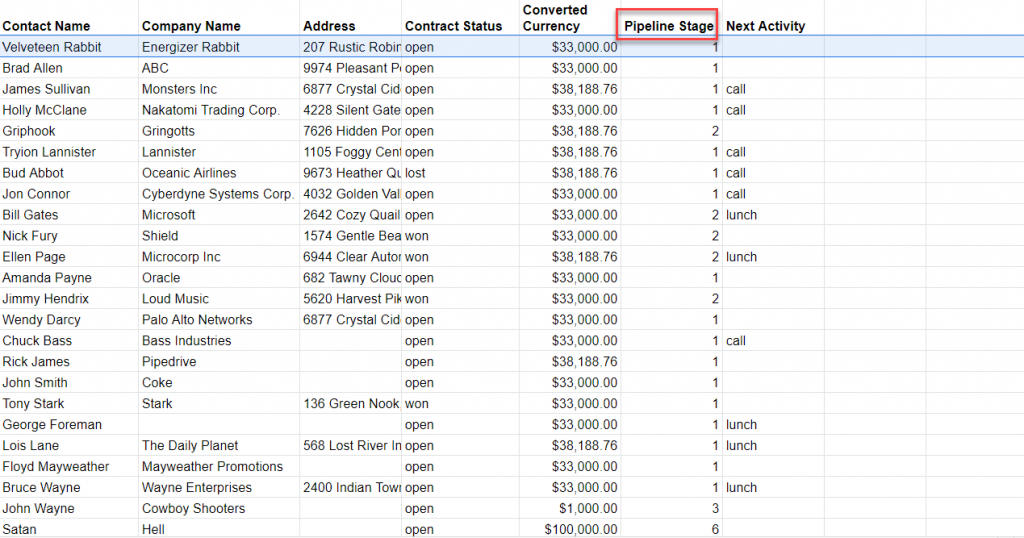
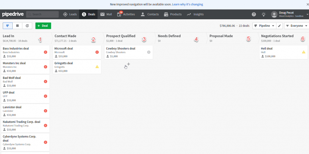
There are a few things we need to consider before moving forward:
- Filtering of won/lost deals
- Numeric values in our table
- Not all stages contain deals
With these things in mind, let's start by making a mapping table to map our numeric values to their respective stage names. Head over to the "Extra_Data" tab and setup a new table.
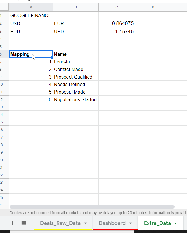
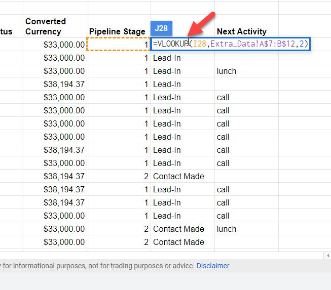
Now, let's use the VLOOKUP() function to map our names to a new column back in our dashboard data. Make a new column next to the Pipeline Stage column in Dashboard and insert the following formula into the cell adjacent to Pipeline Stage column:
=VLOOKUP(I28,Extra_Data!A$7:B$12,2)
Drag it down the whole column, and voila! There are your stage names:
PART 6: LET'S MAKE SOME GRAPHS!
We need to aggregate and wrangle the data a bit. Let's try to aggregate the total value in each stage of the pipeline, similar to the Deals tab in pipedrive. To accomplish this, we will first start by using the QUERY() function in google sheets. This is a quasi-SQL function that is very powerful, but can be quite unwieldy if you don't know what you're doing. I've done the dirty work for you and found the correct query for this use case:
=QUERY(E27:J57,"select J, sum(H) where E = 'open' group by J ")
J corresponds to our column with the labels in it and H corresponds to the column containing the cash value of each deal. I scrolled to the right off screen of the dashboard and setup a "construction" area where we can do these small operations hidden safely from our main dashboard.
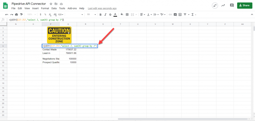
Now, we need to add some "filler" pipeline states and set them equal to zero in order for our chart to show all the states in the right order. Just manually type them in and you'll end up with something like this:
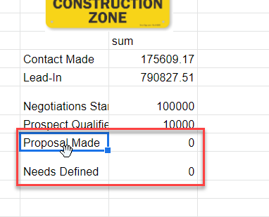
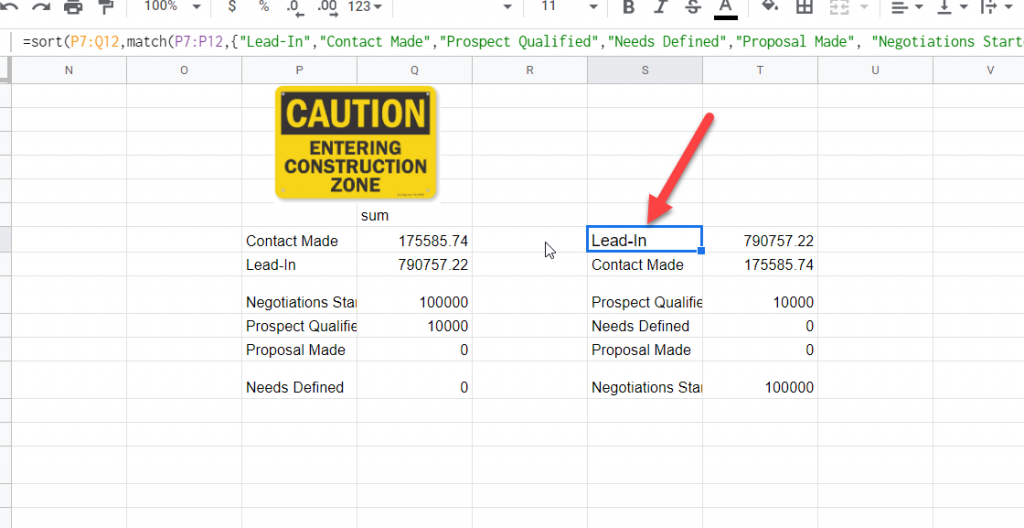
Obviously our data is unsorted. We want "Lead-In" to be our first label, and "Negotiations Started" to be our last label. We will use a combination of the SORT() and MATCH() functions to accomplish this:
=SORT(P7:Q12,MATCH(P7:P12,{"Lead-In","Contact Made","Prospect Qualified","Needs Defined","Proposal Made", "Negotiations Started"},0),1)
Put this in a cell near our previous table, and you should get them sorted by their respective pipeline stage.
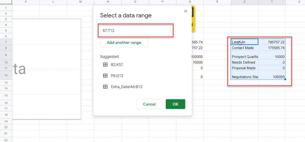
We can use this data to make a bar graph now! Head back over to our main dashboard area and insert a new bar graph. We need to select the data from the last table we just made:
Your chart should automatically infer the correct order since we sorted it with our last function.
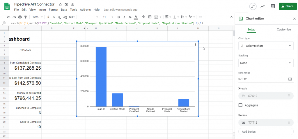
Now it's just time to pretty it up a bit! You can spruce it up yourself by clicking the 3 dots at the top right corner of the chart and clicking "Edit chart".
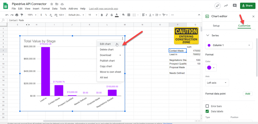
Now that you've finished that, let's make our dashboard a bit more professional. We can remove unnecessary grid lines, throw in some icons, and whatever else you want to make it look good!

Again if you wanna just jump over to the sheet and mess around with a copy, head over to this link. Hope that was a helpful tutorial! Happy connecting!

Halo